
Turo
Architects
The Turo Architects logo design project aimed to create a bold and unique visual identity that reflects the modern and innovative spirit of the architecture firm. The logo combines simplicity with a distinctive twist to enhance brand recognition, while maintaining a professional and architectural essence. The design features a creative use of typography, symmetry, and color to ensure the logo stands out across various mediums.
Logo Concept
At the heart of the logo is the company name "Turo." The design utilizes clean and minimal typography with a striking alteration to the letter "R," which is reversed, adding an element of uniqueness and visual intrigue. This inversion of the "R" represents the firm's ability to think outside the box, break conventions, and offer fresh perspectives in their architectural designs. Additionally, the incorporation of a subtle ruler or scale symbolizes precision, measurement, and the technical expertise required in architecture, further reinforcing the industry-related identity.

Colour
The color palette consists of a sharp contrast between black and phosphorescent green. Black represents professionalism, strength, and stability, while the phosphorescent green adds a bold, energetic touch that reflects creativity and innovation. The glowing effect of the green symbolizes the fresh, forward-thinking ideas that the firm brings to its projects. The combination of these colors ensures that the logo is both eye-catching and memorable.
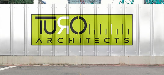
Conclusion
The Turo Architects logo is a carefully crafted design that embodies the company’s modern approach to architecture. The reversed "R" and the ruler element give the logo a distinct identity while still maintaining simplicity and elegance. The color palette of black and phosphorescent green creates a powerful visual contrast, ensuring the logo leaves a lasting impression. This design effectively communicates the firm’s creativity, precision, and innovative mindset in a professional and memorable way.
